Thank you! Your submission has been received!

Oopsie! Something went wrong while submitting the form...

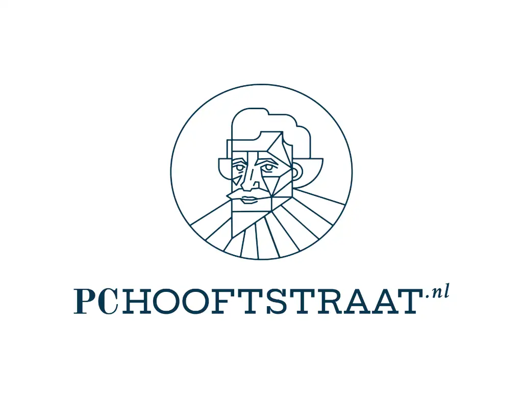
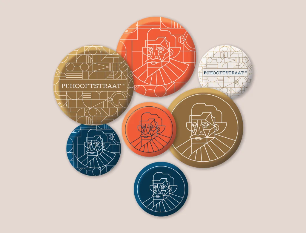
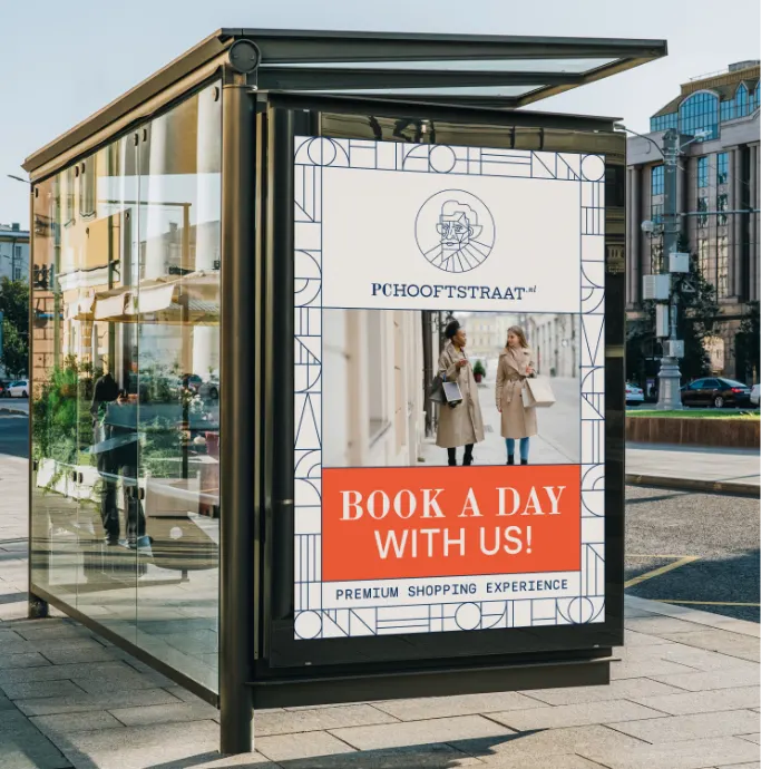
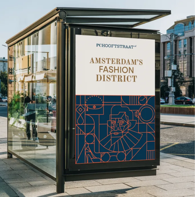
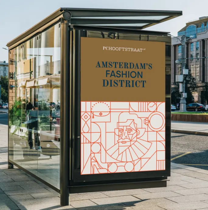
The PC Hooftstraat: who doesn’t know it? The shop owners collective asked us to develop a strategy and graphic identity for their shop index website www.PcHooftstraat.nl to help place the street back on the map as a fashion destination for locals and visitors alike! Fashion houses are established for years, they are part of our cultural lanscape and emulate a sense of luxury that cannot be replaced by anything else. Yet, for the last few years, new trends arise and mark a shift towards modernity. Inspired by this idea we developed an identity that is sophisticated yet bold showcasing Amsterdam’s fashion sense, heritage and architecture. This visual identity will cater to the taste of fashionable shoppers while also inspiring the more daring souls. A modern take on fashion heritage. The use of two different styles of fonts represent the luxorious heritage AND the new trends and modernity. Pieter Corneliszoon Hooft, who the street is named after, was an artist himself and has inspired us to create a modern looking icon of him that can be used as a logo. Unique art nouveau tile design, specialy created for the PC Hooftstraat new identity. The combination of the tiles and luxurious elements generate an interesting eye catchy design. We found art deco aroud the street area and got inspired to create something special for the visual appearance.The tiles and the icon were created in a special way so they can fit togethet as one piece of art.
